Pranil Chandra April 4, 2019
Speak to a Print Expert
It’s a fact that consumers are valuing experiences a lot more and spending a lot less on products. Research has found a real shift in consumer spending with experiences and travel being top of the list and product spending on the steady decline. With that in mind, it is essential that in-store visual merchandising provides a space that is unique, visually exciting and creates instant memories for consumers.
As a mobile obsessed generation, particularly millennials, everything we do should be an opportunity to create shareable content. So this makes it all the more important that your physical store responds to consumers demand for memories and create spaces that will help increase your consumers social currency.
So how can we do that? Let’s take a look at colour. Colour is the quickest way to attract visual attention and create a memorable in-store moment. According to the study “The Impact of Colour in Marketing” by the University of Winnipeg, Canada, consumers make up their minds within 90 seconds of their first interaction with a product And 62 – 90% of this decision is purely based on colour.
Colour is easily interchangeable, so very easy to play with, swap around and bring in seasonal tones. Not only does colour provide consumers with memorable Instagram moments, it can also influence their mood and feelings. Done right, your consumer will not only share content from your store, they will also be more likely to buy more product.
What colours will work for your store? Check out these Instagrammable Colour trends that will not only increase store foot traffic but will also increase your social footprint.
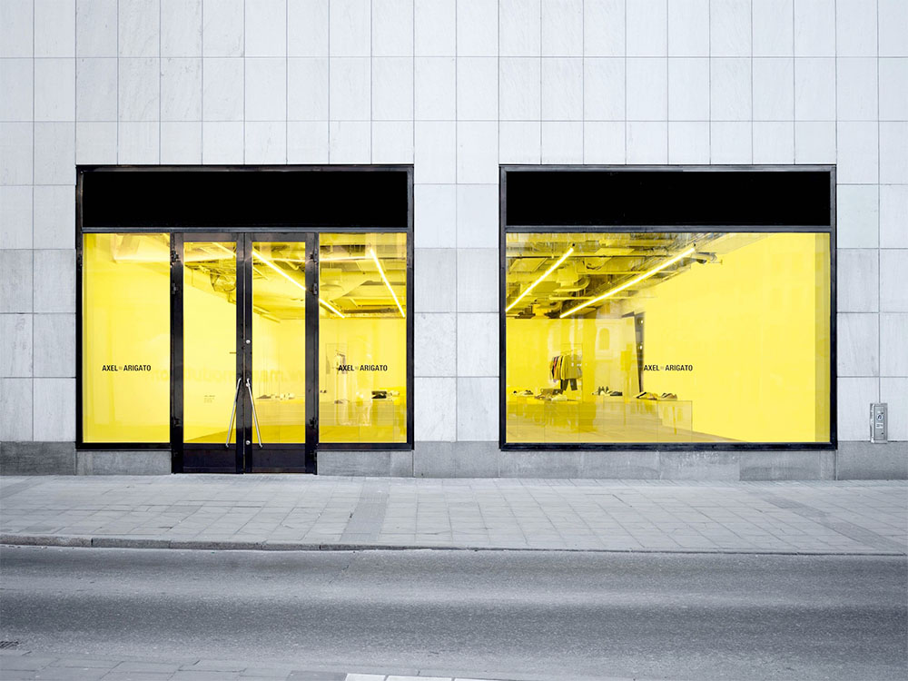
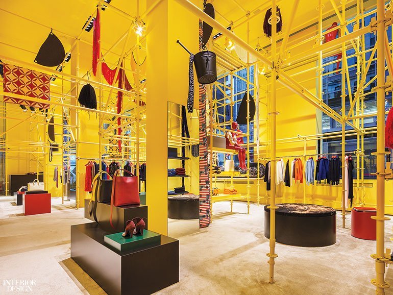
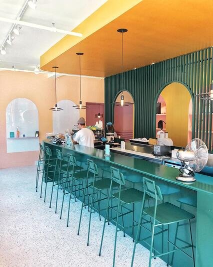
Quickly taking over Millennial Pink from past seasons, Gen Z Yellow is certainly one to watch. And as we’ve seen with millennial pink, it’s not just one colour, it’s a whole spectrum of bright and bold tones for you to be creative with. It’s also good to note that yellow is actually the first colour perceived by the human retina. By incorporating this vibrant and vivid colour, your campaigns will quickly grab consumer attention and most definitely won’t be missed.
The Chroma Blur effect is very on trend across the globe and works fantastically well in store, particularly when used with iridescent finishes and dichroic film. This will give your store interior a sense of light and calm and easy transform your space. Chroma Blur is not a bold as Gen Z Yellow, but is a really effective of way of having a stunning and sophisticated effect in a subtle way. This option is one that will work particularly well with an older demographic.
Colour blocking is really effective for either highlighting specific products, dividing up spaces or even helping consumers navigate their way through your store. There are a variety of ways this can be incorporated, like two tone walls, colour block carpets, designated seating areas or panel drapes. The beauty of colour blocking is that it allows you to be really playful and creative with its versatile components and it never fails to grab attention.
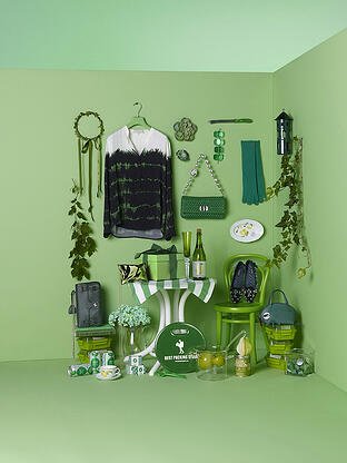
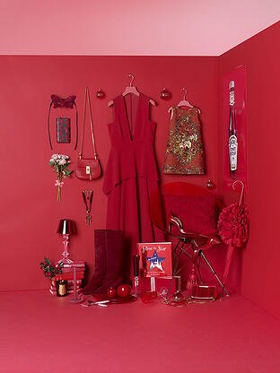
Another great way to to tap into instagrammable colours is to display your merchandise on colour matched or pattern matched fixtures. Tone on tone merchandising creates a sense of cohesiveness and can also be quite calming for consumers as it has a feeling of tidiness, structure and togetherness. Colour co-oridnating will easily work with single merchandising or mass merchandising displays alike.
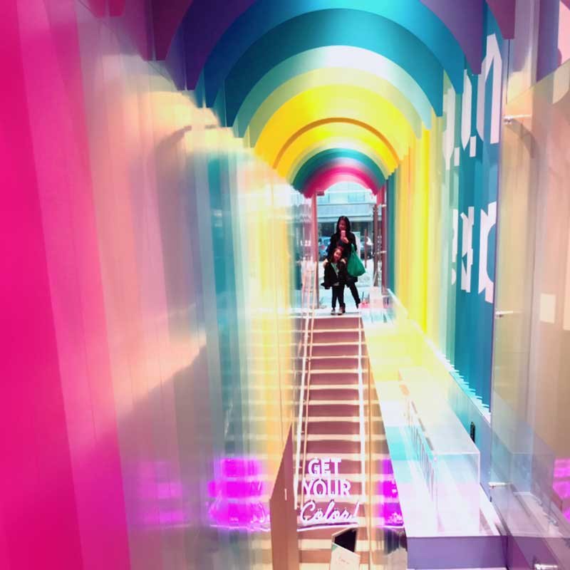
This look is hugely instagrammable. It works extremely well in-store but can work just as well with pop-up stores, trade shows or events. To make the most of this effect, try using on ceiling installations, store entrances or close to mirrors. What better way to provide a space for that all important selfie, right? This look can be achieved with hanging ribbons or perspex paneling and will work best against a natural or white background to really make the rainbow effect pop.
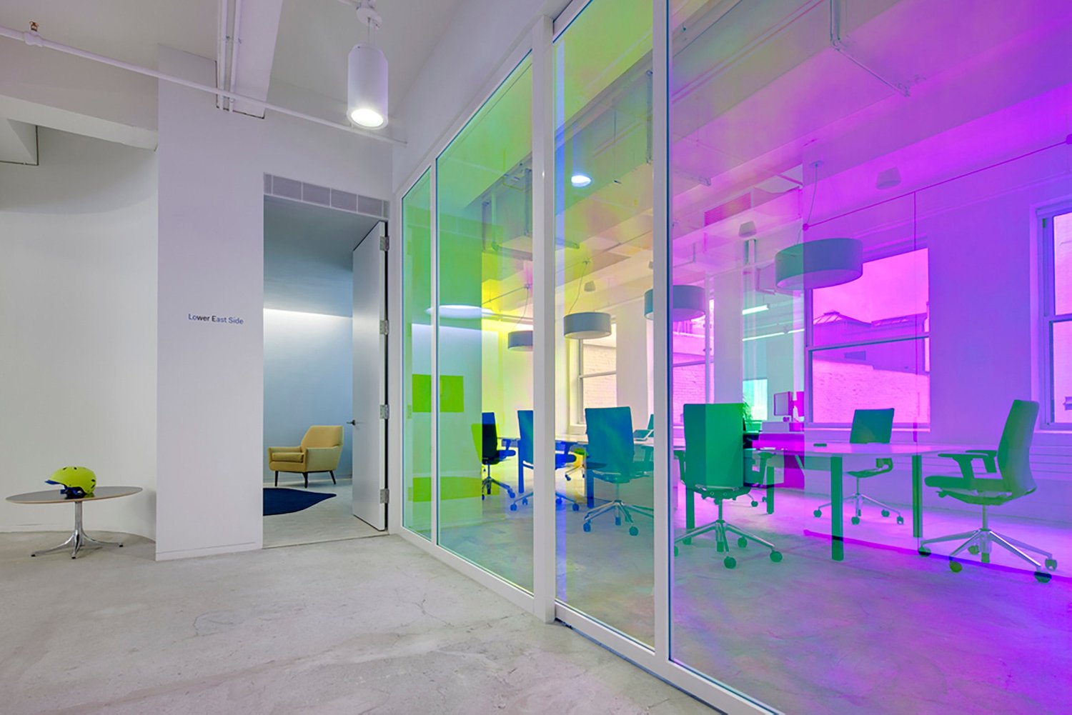
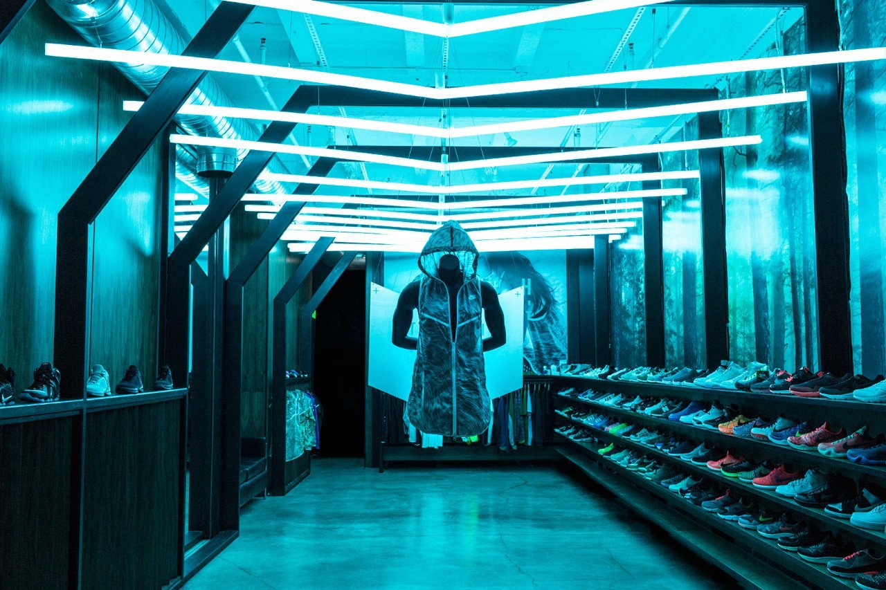
Borrowing from the art world, this trend is about the projection of colourful light that fills the space in the same shade. Submerge your consumer in defused light and create an immersive and mood altering environment that works not only in-store but with pop ups or themed installations . By using this method, you have the ability to really calm or even energise your consumers as they navigate their way through your store. (with their phone in hand or something like this)
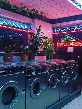
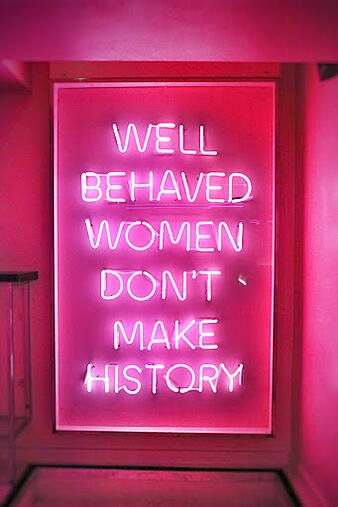
If you are looking for a cool more vibrant energy, Neon flashes work beautifully well. Neon strip lighting can be used perfectly to shine a spotlight on specific fixtures and are really fun to create a focal point. Try using neon light to spell out words, frame plants and beautifully accent products. And of course, don’t forget that instantly Instagrammable signage that will really draw customers in.
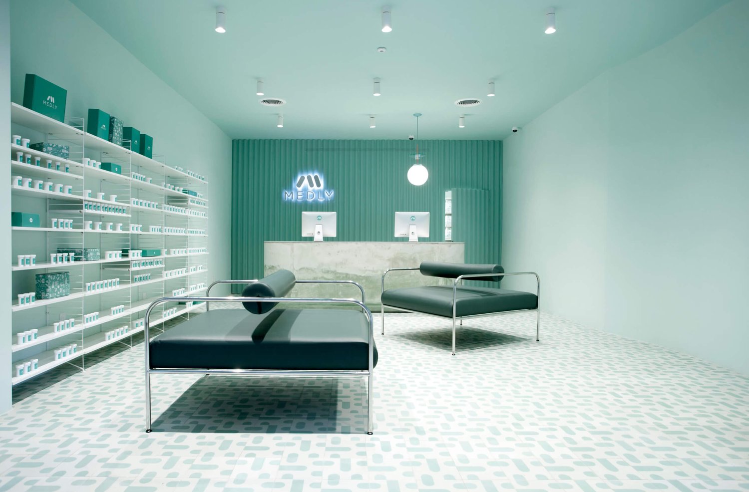
Neo-Mint is creating a bit of a buzz at the moment and and has been tipped as one of the top colour trend for 2020 by WGSN. With a futuristic, yet positive feel, neon-mint is very commercial and highly instagrammable. We can really see how this will not only work across retail stores and products but also in social media campaigns. Watch this space….
As much as we’ve love you millennial pink, it’s now time for us to move on. It’s time that we embrace these new trends within our retail space, filled with positivity and energy. However, always remember, your choice of colour should always support the DNA of your brand identity and align with your target market and demographic.

We'd love to send you innovative tips, news and offers from the world of print and marketing.

Client experience officers are available to answer any questions you have. Use the form below to quickly let us know what you need!